-
Rocket Pop
 Read more: Rocket Pop
Rocket Pop About We were tasked with developing a new food brand and chose to create Rocket Pop, an organic popcorn line. As part of the brand development, we designed the logo and established the color scheme. The logo features a large piece of popcorn with a rocket ship orbiting around it, accompanied by the…
-
Woodland Preschool
 Read more: Woodland Preschool
Woodland Preschool About Woodland Preschool is dedicated to creating a nurturing, inclusive, and safe environment where children feel valued and supported. Their hands-on learning approach fosters curiosity, creativity, and independence, preparing children for kindergarten and lifelong learning. By maintaining a small center, they build close relationships with families and provide personalized care, aiming to become…
-
How To Tape A Hockey Stick
 Read more: How To Tape A Hockey Stick
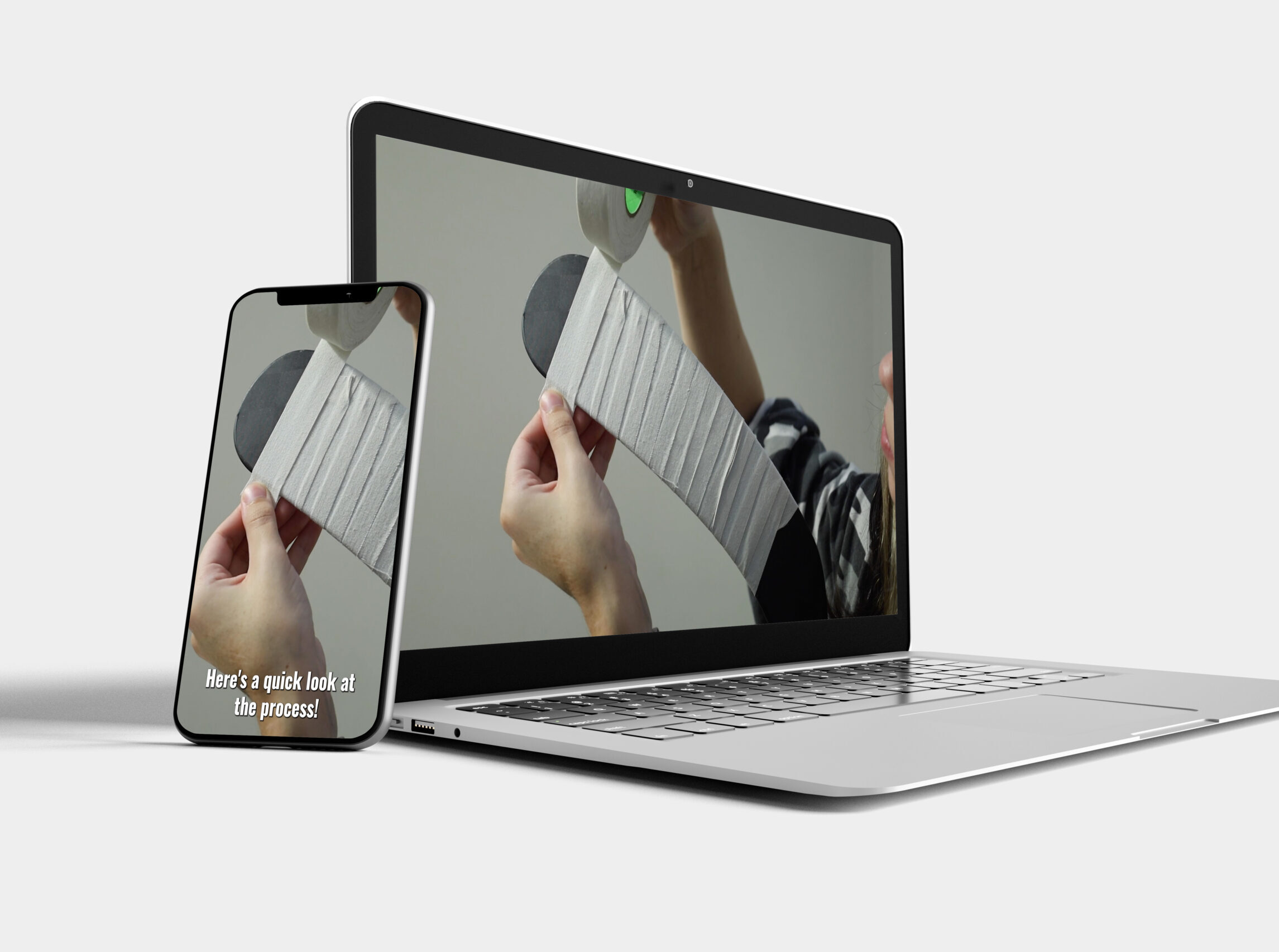
How To Tape A Hockey Stick Project Overview This case study is about creating a quick and clear how-to video on taping a hockey stick for better performance. The video will feature multiple camera angles and a step-by-step guide, with a voiceover to make sure everything is easy to follow. Here’s the plan: Project Name:…
-
Title Sequence
 Read more: Title Sequence
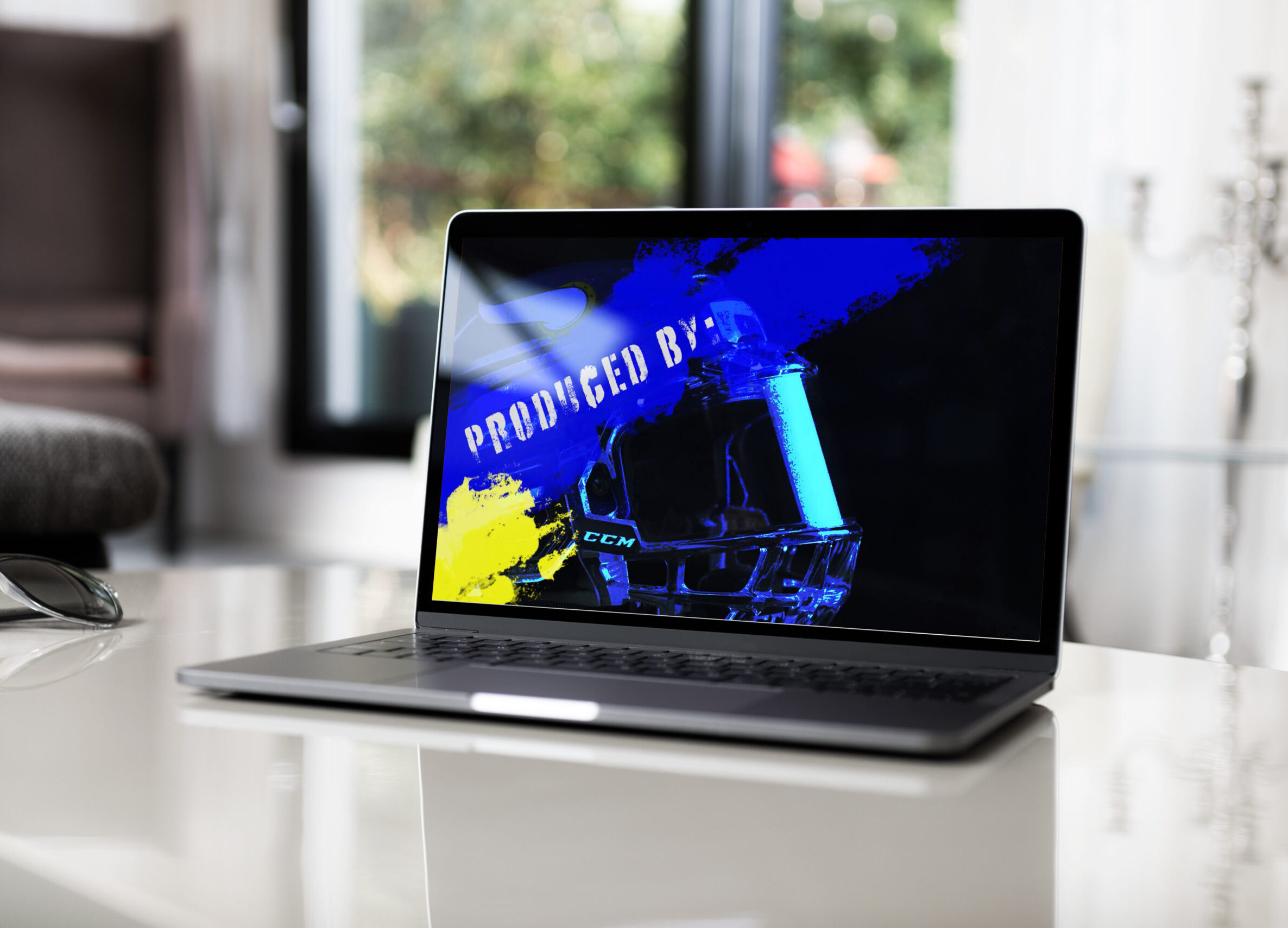
Title Sequence Project Overview For my Digital Editing I class we had to create a how to video then a 30-second long title sequence in my Motion Graphics class to complement my video on how to tape a hockey stick. The sequence features shots of essential hockey gear (stick, gloves, skates, helmet) with blue and…
-
Arruda Bricks Logo
 Read more: Arruda Bricks Logo
Arruda Bricks Logo Looking for the perfect pieces to complete your LEGO masterpiece? Visit Arruda Bricks BrickLink store, “arrudad,” where you’ll find a vast selection of genuine LEGO bricks, sets, and mini-figures to fuel your creativity. Whether you’re a seasoned builder or just starting your LEGO journey, they offer a wide range of products to…
-
Personal Brand
 Read more: Personal Brand
Livin Simpl Livin Simpl combines my name and initials, symbolizing my ability to simplify life through design. I chose green as the brand color because it’s my favorite color. Initially, I envisioned a tree as the logo to complement the name “Livin,” but it felt too complex. I then opted for a simpler approach by…
Livin Simpl
Design Redefined
Transforming Vision into Reality