Hometown Rebrand
Project Objective
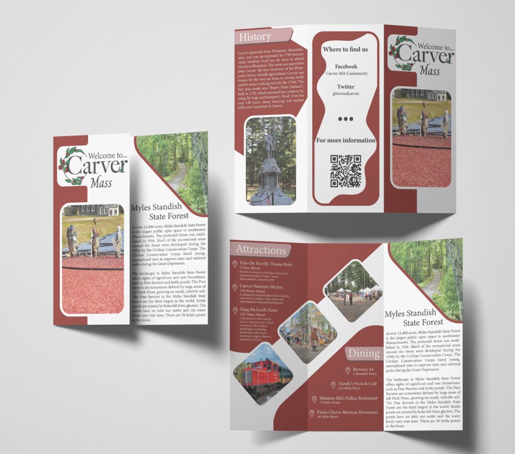
Rebranding my hometown of Carver, Massachusetts, was an exciting challenge. Carver has a lot to offer with its history and natural beauty, but it’s most famous for its cranberry bogs and wildlife. My goal was to create a new logo that truly captures the representation of Carver, setting it apart from the current one while incorporating key elements unique to the town. This logo needed to work well in both color and black and white and adapt to vertical and horizontal orientations.

Discovering Carver’s Unique Elements
To make sure the new logo truly represents Carver, I started by diving into what makes the town unique. Here are some key elements I found:
Myles Standish State Forest: A significant natural landmark offering recreational activities.
Coyotes: These animals are commonly seen around Carver.
Cranberries: Carver is renowned for its cranberry bogs. Cranberries quickly became a central theme for the design.
Edaville Railroad: This historic attraction adds to Carver’s visitors.
King Richard’s Faire: A popular event that draws visitors from all around.
Initial Designs and Ideas
With these elements in mind, I started sketching various combinations:
Combination Designs: Integrating elements like cranberries, Edaville Railroad, King Richard’s Fair, and Myles Standish State Forest resulted in designs that were too complex.
Coyotes: Although popular, a coyote alone didn’t achieve the desired visual impact.
Finding Focus
I realized simplicity was key, so I shifted my focus to cranberries, the most recognizable symbol of Carver. Here’s how the process evolved:
Shape Exploration: I transformed the vines into different shapes to create a distinct border.
Cranberry Vines: I experimented with using cranberry vines as the main design element.
Letter “C” Integration: I tried forming the letter “C” with the cranberry vines.
The Final Design
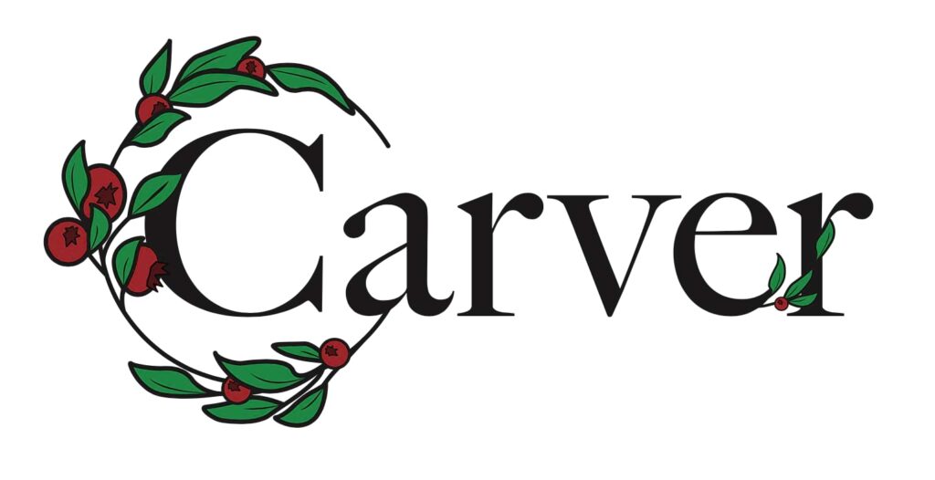
After many iterations, the final logo design came together:
Flowing Typography: The word “Carver” flows seamlessly with the circular vine, with the “a” leading into the circle and a vine extending from the “e” to suggest continuity.
¾ Circle with Cranberries and Leaves: A simple representation of Carver’s identity.

Conclusion
The new logo successfully captures the town by focusing on its most distinctive features. The design is simple making it suitable for various applications. This project not only gives Carver a fresh visual identity but also honors its rich heritage and natural beauty.
